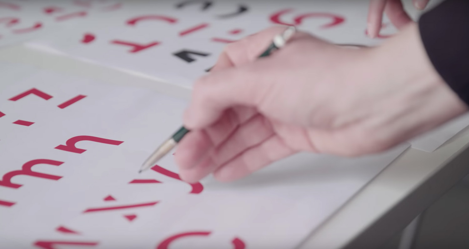
As a designer, I often find myself looking through industry blogs and websites to see what new trends are appearing in the world of graphic design and typography. While my findings are typically limited to inspiring visuals or minor updates in the world of software, I recently came across news of a typeface with much more ambitious goals than just looking nice.
Psychology and design researches at RMIT University in Melbourne worked in collaboration to create Sans Forgetica, a font designed using the principles of cognitive psychology combined with traditional design principles to aid in memory retention. The font is based on a theory called “desirable difficulty,” which suggests that people’s memory can be boosted when their brains have to overcome a minor obstacle.
Sans Forgetica is more difficult to read than most typefaces – and that’s by design. Researchers say that “normal” fonts can almost become too familiar, causing the reader to glance over them without fully paying attention and committing what they read to memory. On the other hand, fonts that are too different or abstract can just become illegible and are not processed at all. By slanting the font backwards and having intentional gaps in the letters, Sans Forgetica’s characters serve as simple puzzles that make you work just a bit harder than usual to fill in the gaps, assisting with memory retention. The creators are quick to point out that the font is best used to emphasize key sections such as definitions, not entire paragraphs or pages.
While the team here at T/K may not immediately start using Sans Forgetica for our next branding project, we find it exciting to see designers working with people from entirely different fields to use design as something more than a visual decoration. If you’d like to try the font for yourself, it’s available as a free download here.
